


Mango
Keya Vadgama
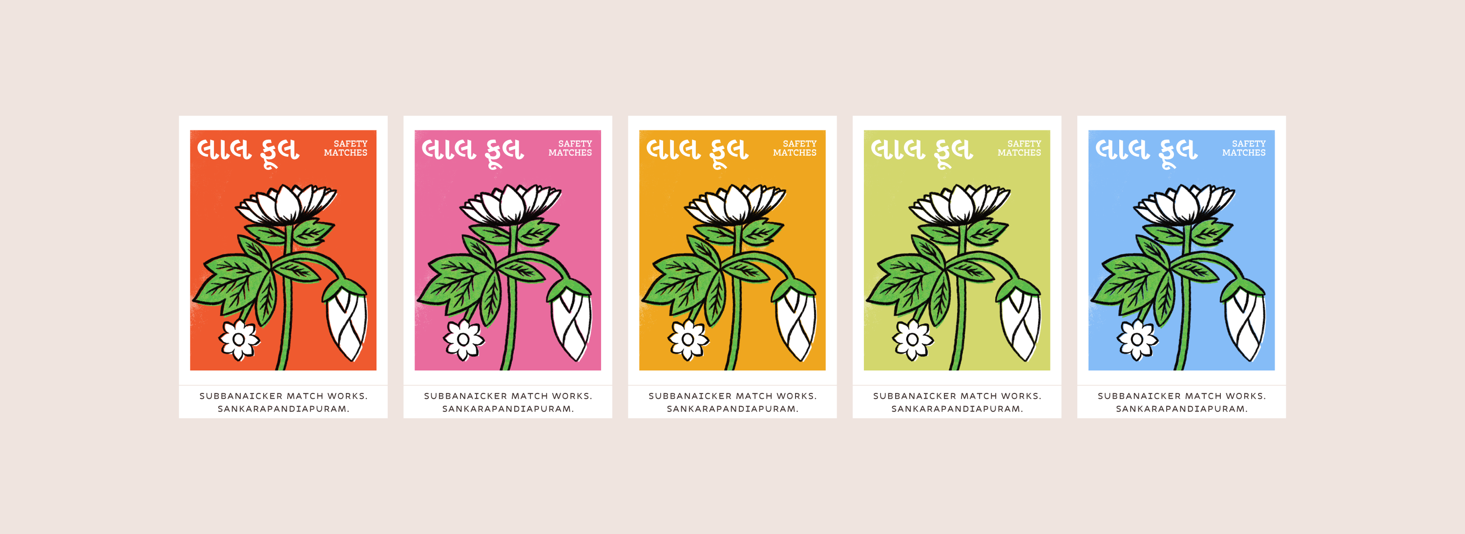
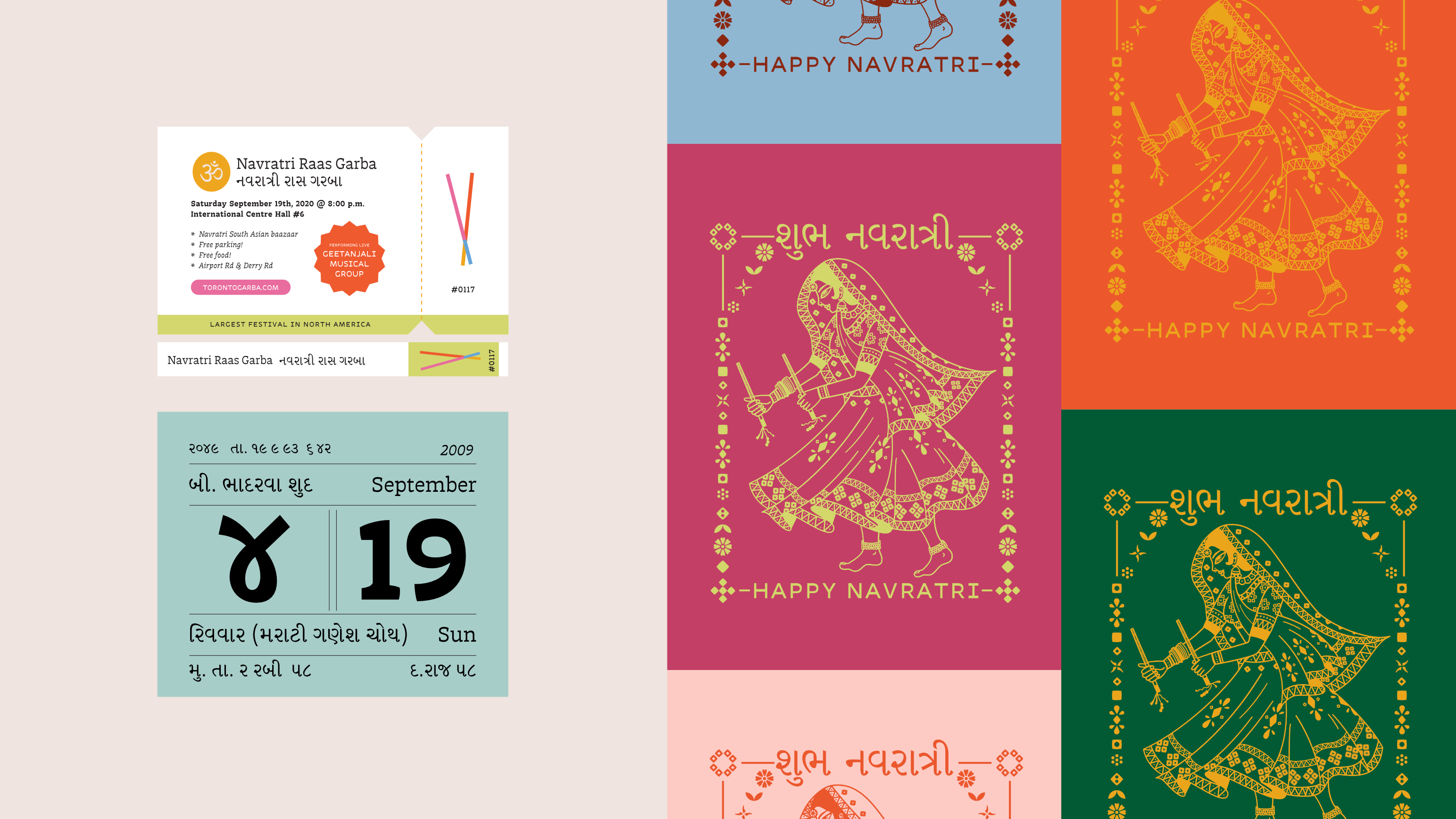
Mango is a multi-script type family intended for short and long passages of text, ideal for documents employing interrupted and/or continuous reading using the Latin and Gujarati scripts. The Gujarati styles draw influence from calligraphic conventions and contemporary solutions to technical restraints for the UI style. The Latin styles explore a solution that employs subtle horizontal contrast to better harmonize with the Gujarati design.

Variable font playground
350


Q&A
Q: How did designing multiple scripts at the same within one project influence your workflow and/or design thinking?
A: The pressure to ‘harmonize’ between scripts felt like a daunting prospect at the beginning of the project, particularly because I was working with scripts whose angle of contrast were opposite to each other. It can be easy to fall into the trap of trying to copy features between scripts (e.g trying to take serifs from the Latin and incorporate it somehow into the design of the other script) but there are other ways to harmonize such as texture, colour density, and optical height, that then allow you to keep to true to the typographic traditions of the scripts you’re working with.
Q: What is something you did (or you wish you had done/known) in preparation for the course that ended up being helpful during the development of the typeface?
A: Something I wish I had done: listen to your gut when trying to find the direction/voice for your typeface instead of doing what you ‘think’ you should do. While it’s always helpful to take the advice of others, you also need to be happy with the direction of your project. Something I did that was helpful: understand that I’m not here to reinvent the wheel and embrace writing traditions. And most importantly, accept that my process may be different from those around me. Whether it was designing from analog sketches or starting directly in Glyphs — I went with the process that felt natural and most efficient to me in that moment.
Q: Aside from producing new typefaces, what are some other ways in which you hope to contribute to type design and the wider design community?
A: I hope to empower other women and people of colour to pursue type design in the same way that others in this industry have done for me, through mentorship, workshops, type crits, and open collaboration.
Colophon
And that’s a wrap! It’s been a pleasure to share the MATD19/20 final projects with you. We would like to send a big thank you to everyone who made this possible: Gerry, Fiona, Fred, Victor, Ewan, Borna, Vaibhav, Cheng, Bianca, Laurence, Frank and all the other lecturers for their time and feedback. Shoutout to coop, Park House, the coffee machine and the farmer’s market.
Typeface: Ohno Type’s Degular.
Team
Branding
John Mawby
Adriana Pérez Conesa
José Carratala
Jeremy Johnson
Content
Michaela Staton
Geneviève Cugnart
Development
Simon Thiefes
Eric Karnes
Radek Łukasiewicz
Team
PM
Keya Vadgama
Simon Thiefes
UI/UX
Keya Vadgama
Mark Zhu
Ryan Williamson